Correlations (R,Python)
Red means that the page does not exist yet
Gray means that the page doesn’t yet have separation of different levels of understanding
Orange means that the page is started
In this website you can choose to expand or shrink the page to match the level of understanding you want.
- If you do not expand any (green) subsections then you will only see the most superficial level of description about the statistics. If you expand the green subsections you will get details that are required to complete the tests, but perhaps not all the explanations for why the statistics work.
- If you expand the blue subsections you will also see some explanations that will give you a more complete understanding. If you are completing MSc-level statistics you would be expected to understand all the blue subsections.
- Red subsections will go deeper than what is expected at MSc level, such as testing higher level concepts.
Please make sure you’ve read about variance within the dispersion section before proceeding with this page.
Correlations capture how much two variables are associated with each other by calculating the proportion of the total variance explained by how much the two variables vary together (explained below). To understand this, we need to think about how each variable varies independently, together and compare the two. We’ll use the gapminder data to look at how how life expectancy correlated with GDP in 2007:
library(gapminder)
library(ggplot2)

# create a new data frame that only focuses on data from 2007
gapminder_2007 <- subset(
  gapminder,   # the data set
  year == 2007
)

# a reminder of the data frame
rmarkdown::paged_table(head(gapminder_2007))
# Basic scatter plot
ggplot(
data = gapminder_2007,
aes(
x=gdpPercap,
y=lifeExp
)
) + geom_point()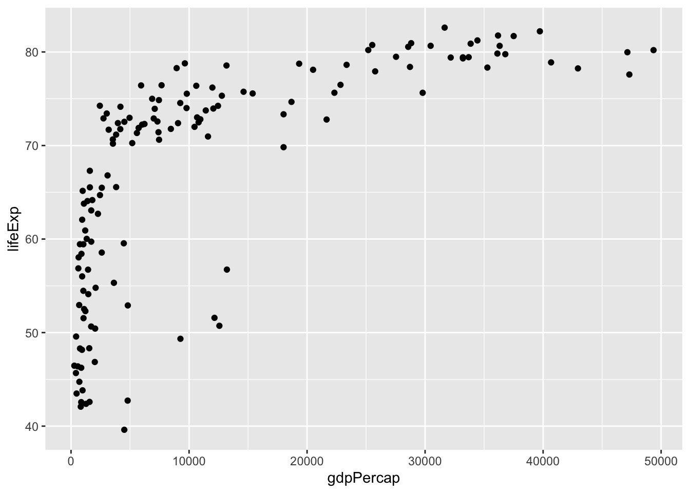
#importing matplotlib library
import matplotlib.pyplot as plt

# load the gapminder module and import the gapminder dataset
from gapminder import gapminder

# create a new data frame that only focuses on data from 2007
gapminder_2007 = gapminder.loc[gapminder['year'] == 2007]

# a reminder of the data frame
gapminder_2007

#scatter plot for the dataset
plt.scatter(gapminder_2007["gdpPercap"], gapminder_2007["lifeExp"])

# add title on the x-axis
plt.xlabel("GDP per capita")

# add title on the y-axis
plt.ylabel("Life Expectancy")

# show the plot
plt.show()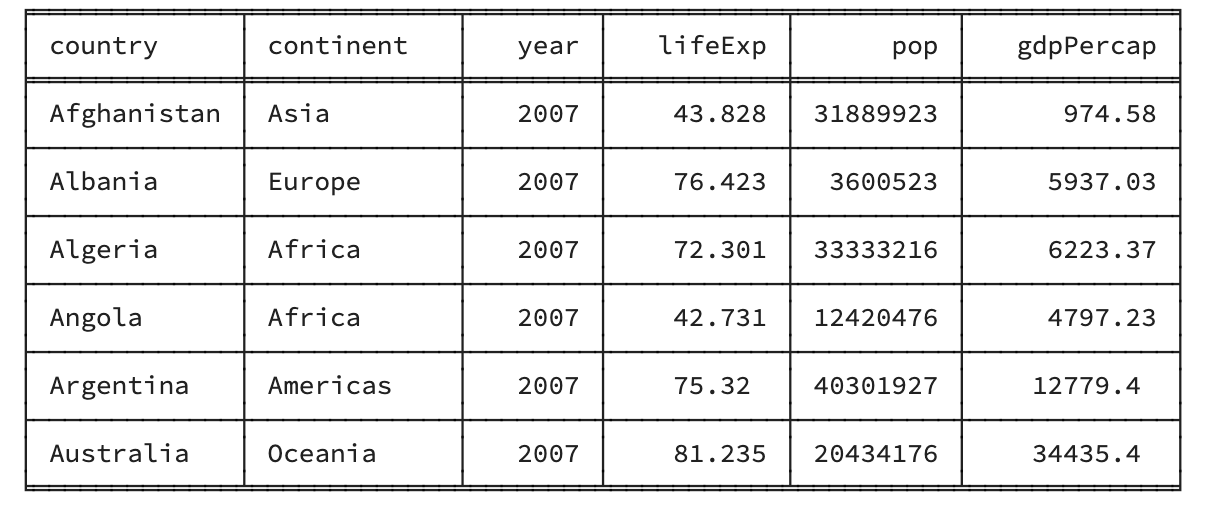
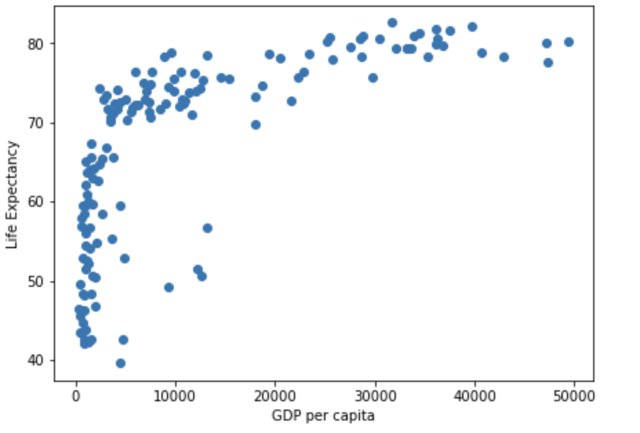
Note that in the figure above each dot represents an individual point from our data. Each dot represents an individual country (with the x-coordinte being the GDP per capita, and the y-coordinate being the Life Expectancy).
Generally speaking, a correlation tells you how much of the total variance is explained by how much the variables vary together. To understand this, lets start by clarifying how you understand the variance of individual variables.
Variance of individual variables
For more insight into variance as a concept, have a look at dispersion, but here we will focus on variance within the context of correlations. You have 2 variables, x (for the x-axis) and y (for the y-axis), and the variance for each of those is:
\[ var_x = \frac{\sum(x_i-\bar{x})^2}{N-1} \]
\[ var_y = \frac{\sum(y_i-\bar{y})^2}{N-1} \]
Just a reminder of what each part of the formula is:
\(\sum\) is saying to add together everything (i.e. the sum of everything within the brackets for this formula)
\(x_i\) refers to each individual’s x-score
\(y_i\) refers to each individual’s y-score
\(\bar{x}\) refers to the mean x-score across all participants
\(\bar{y}\) refers to the mean y-score across all participants
\(N\) refers to the number of participants
\(N-1\) is degrees of freedom, used for this calculation as you are calculating the variance within a sample, rather than variance within the whole population (which you would just use N for; this is explained further in the dispersion section).
The variance for life expectancy can be visualised as the sum of the square of the following:
# Basic scatter plot

life_exp_resid <- ggplot(
  data = gapminder_2007,
  aes(
    x=gdpPercap,
    y=lifeExp
  )
) +
  geom_point() +
  geom_hline(
    yintercept = mean(gapminder_2007$lifeExp),
    linetype   = "dashed",
    color      = "#006599",
    linewidth  = 1
  ) +
  coord_cartesian(ylim = c(30, 85)) +
  xlab("GDP per capita") +
  ylab("Life Expectancy") +
  geom_segment(
    aes(
      xend = gdpPercap,
      yend = mean(lifeExp),
      color = "resid"
    )
  ) +
  theme(
    legend.position = "none"
  )

# ggsave("life_exp_resid.png", life_exp_resid)
life_exp_resid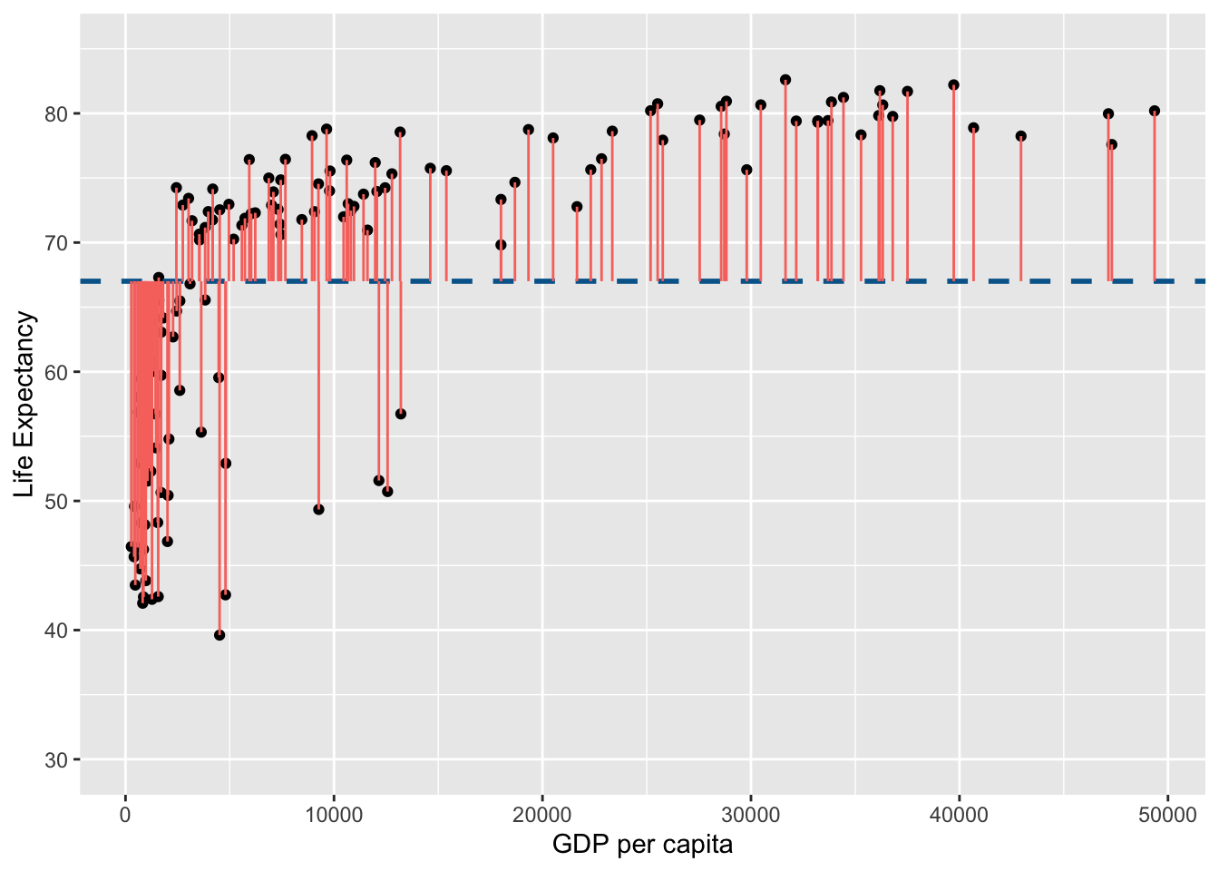
fig, ax = plt.subplots(figsize =(7, 5))

#scatter plot for the dataset
plt.scatter(gapminder_2007["gdpPercap"], gapminder_2007["lifeExp"])

# add horizontal line for the mean of 'lifeExp'
plt.axhline(y=gapminder_2007["lifeExp"].mean(), color='b', ls='--')

# add vertical lines from the individual point to the mean of "lifeExp"
plt.vlines(x=gapminder_2007["gdpPercap"],ymin=gapminder_2007["lifeExp"], ymax=gapminder_2007["lifeExp"].mean(), colors='red', lw=0.5)

# add title on the x-axis
plt.xlabel("GDP per capita")

# add title on the y-axis
plt.ylabel("Life Expectancy")

# show the plot
plt.show()

## save the plot
#plt.savefig('life_exp_resid.png')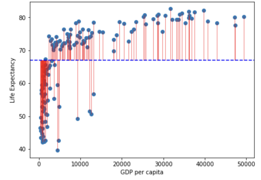
Note that in the figure above the horizontal blue dotted line represent the mean of Life Expectancy. Variance is the total after squaring all the residuals (pink lines) and dividing this total by the degrees of freedom.
Lets look at the variance of GDP per capita:
gdp_resid <- ggplot(
  data = gapminder_2007,
  aes(
    x=gdpPercap,
    y=lifeExp
  )
) +
  geom_point() +
  geom_vline(
    xintercept = mean(gapminder_2007$gdpPercap),
    linetype   = "dashed",
    color      = "#006599",
    size       = 1
  ) +
  coord_cartesian(ylim = c(30, 85)) +
  xlab("GDP per capita") +
  ylab("Life Expectancy") +
  geom_segment(
    aes(
      xend = mean(gdpPercap),
      yend = lifeExp,
      color = "resid"
    )
  ) +
  theme(
    legend.position = "none"
  )
Warning: Using `size` aesthetic for lines was deprecated in ggplot2 3.4.0.
ℹ Please use `linewidth` instead.ggsave("gdp_resid.png", gdp_resid)Saving 7 x 5 in imagegdp_resid
fig, ax = plt.subplots(figsize =(7, 5))

#scatter plot for the dataset
plt.scatter(gapminder_2007["gdpPercap"], gapminder_2007["lifeExp"])

# add vertical line for the mean of "gdpPercap"
plt.axvline(x=gapminder_2007["gdpPercap"].mean(), color='b', ls='--')

# add horizontal lines from the individual point to the mean of "gdpPercap"
plt.hlines(y=gapminder_2007["lifeExp"],xmin=gapminder_2007["gdpPercap"], xmax=gapminder_2007["gdpPercap"].mean(), colors='red', lw=0.5)

# add title on the x-axis
plt.xlabel("GDP per capita")

# add title on the y-axis
plt.ylabel("Life Expectancy")

# show the plot
plt.show()

## save the plot
#plt.savefig('life_exp_resid.png')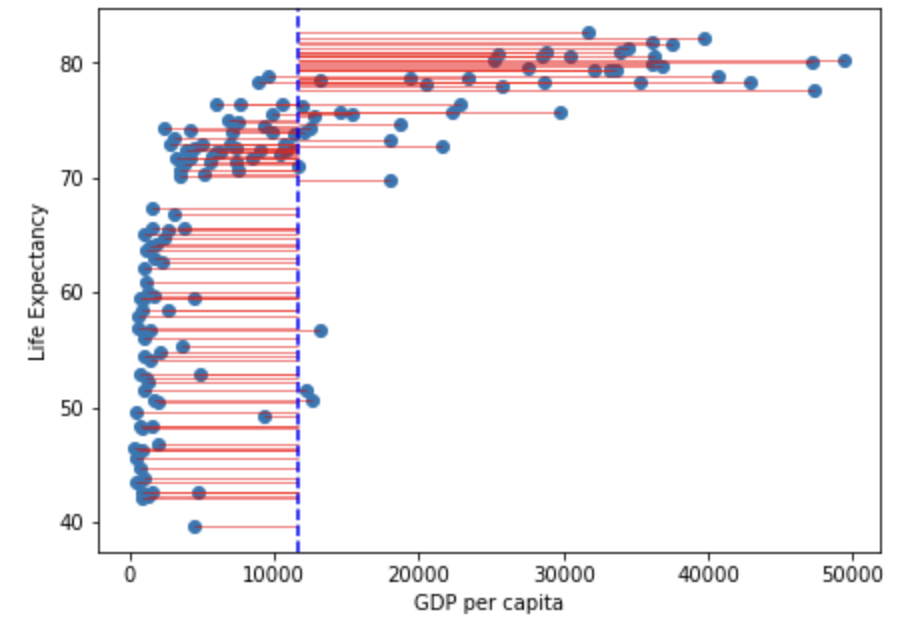
Note that in the figure above the vertical blue dotted line represents the mean gdp per capita. Variance is the total after squaring all the residuals (pink lines) and dividing this total by the degrees of freedom.
Total variance
A correlation captures how much of the total variance is explained by the overlapping variance between the x and y axes. So we first need to capture the total variance. We do this by multiplying the variance for \(x\) by the variance for \(y\) (and square rooting to control for the multiplication itself):
\[ totalVariance = \sqrt{\frac{\sum(x_i-\bar{x})^2}{N-1}}*\sqrt{\frac{\sum(y_i-\bar{y})^2}{N-1}} \]
(Which is the same as:
\[ totalVariance = \frac{\sqrt{\sum(x_i-\bar{x})^2*\sum(y_i-\bar{y})^2}}{N-1} \]
)
Or, to use the figures above:
| $Total$ $Var$ = | sqrt( \^2) $$ \frac{}{N-1} $$ \^2) $$ \frac{}{N-1} $$ |
$*$ | sqrt(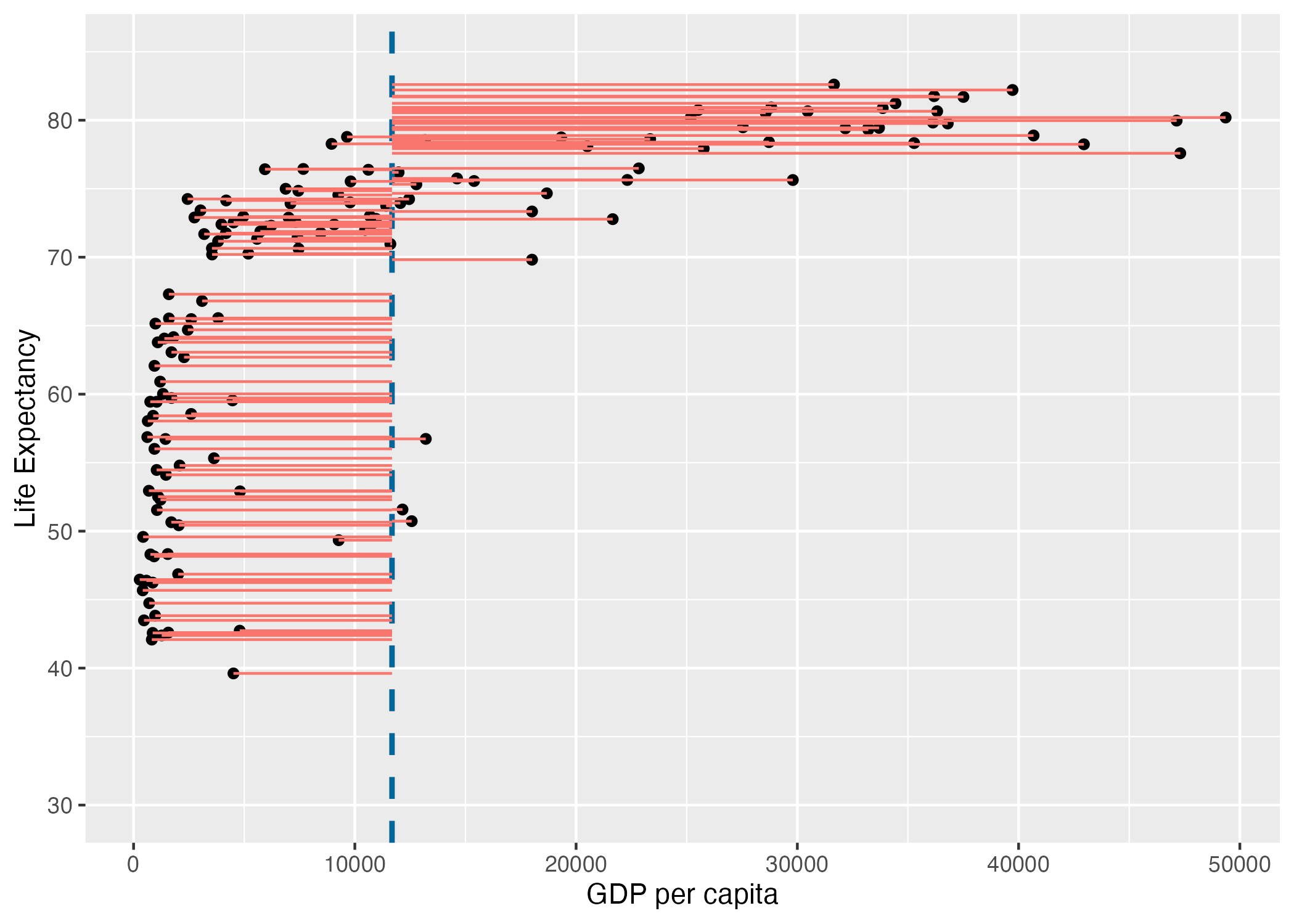 \^ 2) $$ \frac{}{N-1} $$ \^ 2) $$ \frac{}{N-1} $$ |
This is analogous to understanding the total area of a rectangle by multiplying the length of each side with each other.
Shared variance between \(x\) and \(y\) (AKA covariance)
An important thing to note, is that variance of a single variable, in this case x:
\[ var_x = \frac{\sum(x_i-\bar{x})^2}{N-1} \]
could also be written as:
\[ var_x = \frac{\sum(x_i-\bar{x})(x_i-\bar{x})}{N-1} \]
To look at the amount that x and y vary together, we can adapt a formula for how much \(x\) varies (with itself as written above) to now look at how much \(x\) varies with \(y\):
\[ var_{xy} = \frac{\sum(x_i-\bar{x})(\color{red}{y_i-\bar{y}})}{N-1} \]
This can be visualised as the residuals from the means multiplied by each other for each data point:
shared_resid <- ggplot(
  data = gapminder_2007,
  aes(
    x=gdpPercap,
    y=lifeExp
  )
) +
  geom_point() +
  geom_vline(
    xintercept = mean(gapminder_2007$gdpPercap),
    linetype   = "dashed",
    color      = "#006599",
    size       = 1
  ) +
  coord_cartesian(ylim = c(30, 85)) +
  xlab("GDP per capita") +
  ylab("Life Expectancy") +
  geom_segment(
    aes(
      xend = mean(gdpPercap),
      yend = lifeExp,
      color = "GDP residuals"
    )
  ) +
  geom_segment(
    aes(
      xend = gdpPercap,
      yend = mean(lifeExp),
      color = "Life Expectancy Residuals"
    )
  ) +
  geom_hline(
    yintercept = mean(gapminder_2007$lifeExp),
    linetype   = "dashed",
    color      = "#006599",
    size       = 1
  )
ggsave("shared_resid.png", shared_resid)
Saving 7 x 5 in imageshared_resid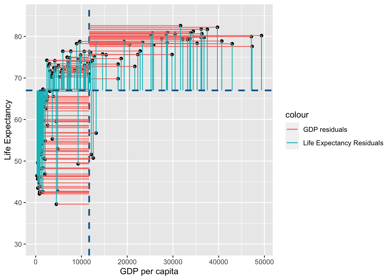
#scatter plot for the dataset
plt.scatter(gapminder_2007["gdpPercap"], gapminder_2007["lifeExp"])

# add vertical line for the mean of "gdpPercap"
plt.axvline(x=gapminder_2007["gdpPercap"].mean(), color='b', ls='--')

# add horizontal lines from the individual point to the mean of "gdpPercap"
plt.hlines(y=gapminder_2007["lifeExp"],xmin=gapminder_2007["gdpPercap"], xmax=gapminder_2007["gdpPercap"].mean(), colors='red', lw=0.5)

# add horizontal line for the mean of "lifeExp"
plt.axhline(y=gapminder_2007["lifeExp"].mean(), color='b', ls='--')

# add vertical lines from the individual point to the mean of "lifeExp"
plt.vlines(x=gapminder_2007["gdpPercap"],ymin=gapminder_2007["lifeExp"], ymax=gapminder_2007["lifeExp"].mean(), colors='green', lw=0.5)

# add title on the x-axis
plt.xlabel("GDP per capita")

# add title on the y-axis
plt.ylabel("Life Expectancy")

# show the plot
plt.show()

# save the plot
plt.savefig('shared_resid.png')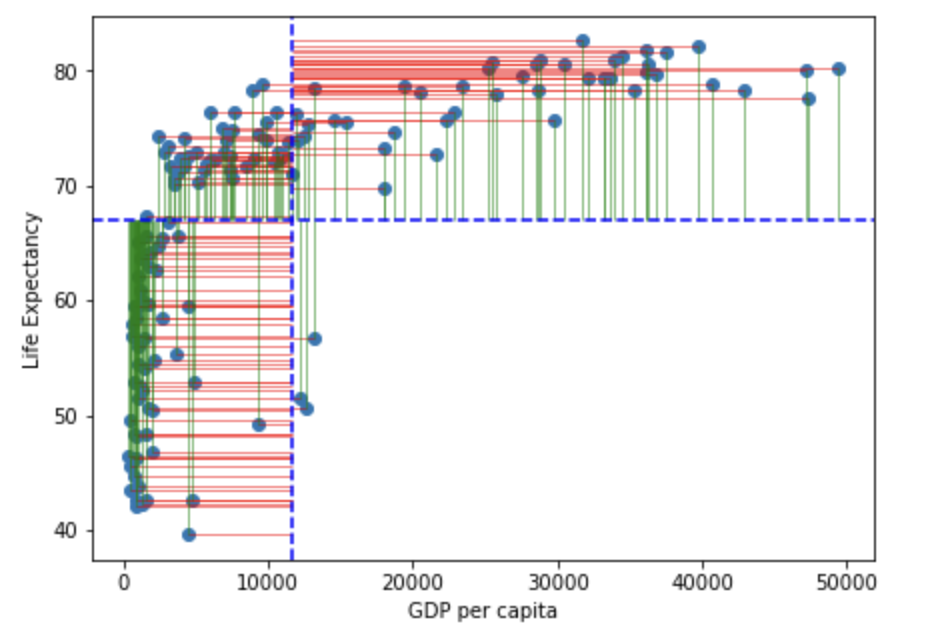
Comparing \(shared\) \(variance\) (\(var_{xy}\)) to \(total\) \(variance\)
To complete a Pearson’s R correlation we need to compare the amount that \(x\) and \(y\) vary together to the total variance (in which you calculate how much x and y vary separately and multiply them) to calculate the proportion of \(total\) \(variance\) is explained by the \(shared\) \(variance\) (\(var_{xy}\)).
\[ \frac{var_{xy}}{totalVariance} = \frac{(\sum(x_i-\bar{x})(y_i-\bar{y}))/(N-1)} {\sqrt{\sum(x_i-\bar{x})^2*\sum(y_i-\bar{y})^2}/(N-1)} \]
Note that both \(var_{xy}\) and \(totalVariance\) correct for the degrees of freedom, so the \(N-1\)s cancel each other out:
\[ r = \frac{var_{xy}}{totalVariance} = \frac{\sum(x_i-\bar{x})(y_i-\bar{y})} {\sqrt{\sum(x_i-\bar{x})^2*\sum(y_i-\bar{y})^2}} \]
Lets apply this to the gapminder data above to calculate \(r\):
varxy =
  sum(
    (gapminder_2007$gdpPercap - mean(gapminder_2007$gdpPercap)) *
    (gapminder_2007$lifeExp - mean(gapminder_2007$lifeExp))
   )


totalvar = sqrt(
  sum((gapminder_2007$gdpPercap - mean(gapminder_2007$gdpPercap))^2) *
  sum((gapminder_2007$lifeExp - mean(gapminder_2007$lifeExp))^2)
)
varxy/totalvar
[1] 0.6786624# Import math Library
import math
varxy = sum(
(gapminder_2007["gdpPercap"] - gapminder_2007["gdpPercap"].mean())*
(gapminder_2007["lifeExp"] - gapminder_2007["lifeExp"].mean()))
totalvar = math.sqrt(
sum((gapminder_2007["gdpPercap"] - gapminder_2007["gdpPercap"].mean())**2)*
sum((gapminder_2007["lifeExp"] - gapminder_2007["lifeExp"].mean())**2))
varxy/totalvar0.6786623986777583If the above calculation is correct, we’ll get exactly the same value when using the cor.test function:
cor.test(gapminder_2007$gdpPercap, gapminder_2007$lifeExp)
    Pearson's product-moment correlation

data:  gapminder_2007$gdpPercap and gapminder_2007$lifeExp
t = 10.933, df = 140, p-value < 2.2e-16
alternative hypothesis: true correlation is not equal to 0
95 percent confidence interval:
 0.5786217 0.7585843
sample estimates:
      cor
0.6786624
import scipy.stats
scipy.stats.pearsonr(gapminder_2007["gdpPercap"], gapminder_2007["lifeExp"])(0.6786623986777585, 1.6891897969647515e-20)Again, a reminder of how shared variance could be visualised:

A question you might have at this point, is whether the above figure of shared variance seems consistent with 67.9% of \(total\) \(variance\) being explained by overlapping variance between \(x\) and \(y\)?
If \(x\) and \(y\) vary together, then you would expect either:
a higher \(x\) data point should be associated with a higher \(y\) data point (positive association)
a higher \(x\) data point should be associated with a lower \(y\) data point (negative association)
If there is a positive association, then you would expect there to be consistency in \(x\) and \(y\) both being above their own respective means, or both being below their respective means consistently, which is what we see above.
If there is a negative association, you would expect \(y\) to generally be below its mean when \(x\) is above its mean, and vice-versa. Lets visualise this by transformingthe \(life\) \(expectancy\) to be inverted by subtracting it from 100. This will make younger people older and older people younger:
inverted_resid <- ggplot(
  data = gapminder_2007,
  aes(
    x=gdpPercap,
    y=125-lifeExp
  )
) +
  geom_point() +
  geom_vline(
    xintercept = mean(gapminder_2007$gdpPercap),
    linetype   = "dashed",
    color      = "#006599",
    size       = 1
  ) +
  coord_cartesian(ylim = c(30, 85)) +
  xlab("GDP per capita") +
  ylab("Life Expectancy") +
  geom_segment(
    aes(
      xend = mean(gdpPercap),
      yend = 125-lifeExp,
      color = "GDP residuals"
    )
  ) +
  geom_segment(
    aes(
      xend = gdpPercap,
      yend = mean(125-lifeExp),
      color = "Life Expectancy Residuals"
    )
  ) +
  geom_hline(
    yintercept = mean(125-gapminder_2007$lifeExp),
    linetype   = "dashed",
    color      = "#006599",
    size       = 1
  )

inverted_resid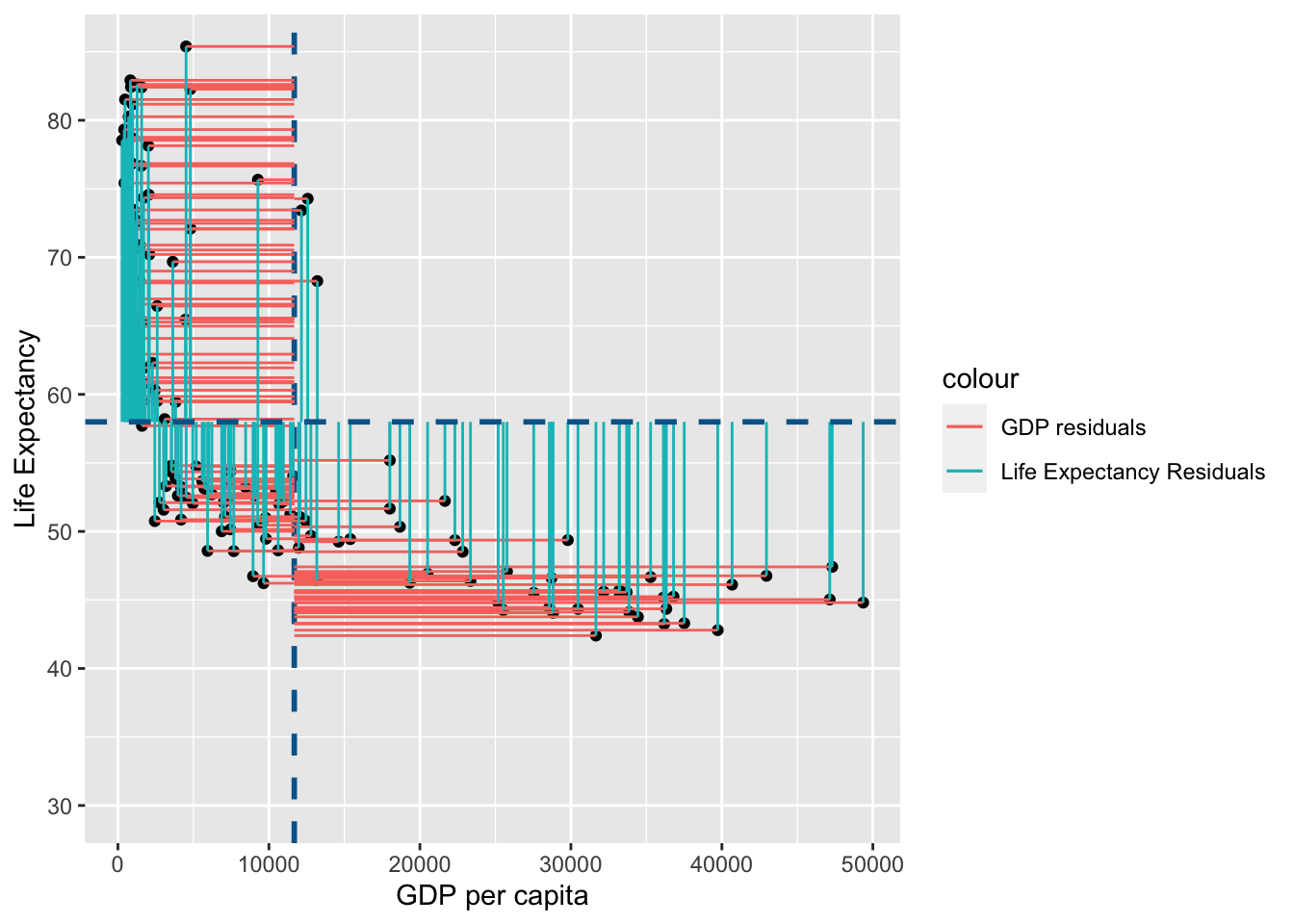
fig, ax = plt.subplots(figsize =(7, 5))

#scatter plot for the dataset
plt.scatter(gapminder_2007["gdpPercap"], 125-gapminder_2007["lifeExp"])

# add vertical line for the mean of "gdpPercap"
plt.axvline(x=gapminder_2007["gdpPercap"].mean(), color='b', ls='--')

# add horizontal lines from the individual point to the mean of "gdpPercap"
plt.hlines(y=125-gapminder_2007["lifeExp"],xmin=gapminder_2007["gdpPercap"], xmax=gapminder_2007["gdpPercap"].mean(), colors='red', lw=0.5)

# add horizontal line for the mean of "lifeExp"
plt.axhline(y=125-gapminder_2007["lifeExp"].mean(), color='b', ls='--')

# add vertical lines from the individual point to the mean of "lifeExp"
plt.vlines(x=gapminder_2007["gdpPercap"],ymin=125-gapminder_2007["lifeExp"], ymax=125-gapminder_2007["lifeExp"].mean(), colors='green', lw=0.5)

# add title on the x-axis
plt.xlabel("GDP per capita")

# add title on the y-axis
plt.ylabel("Life Expectancy")

# show the plot
plt.show()

## save the plot
#plt.savefig('inverted_resid.png')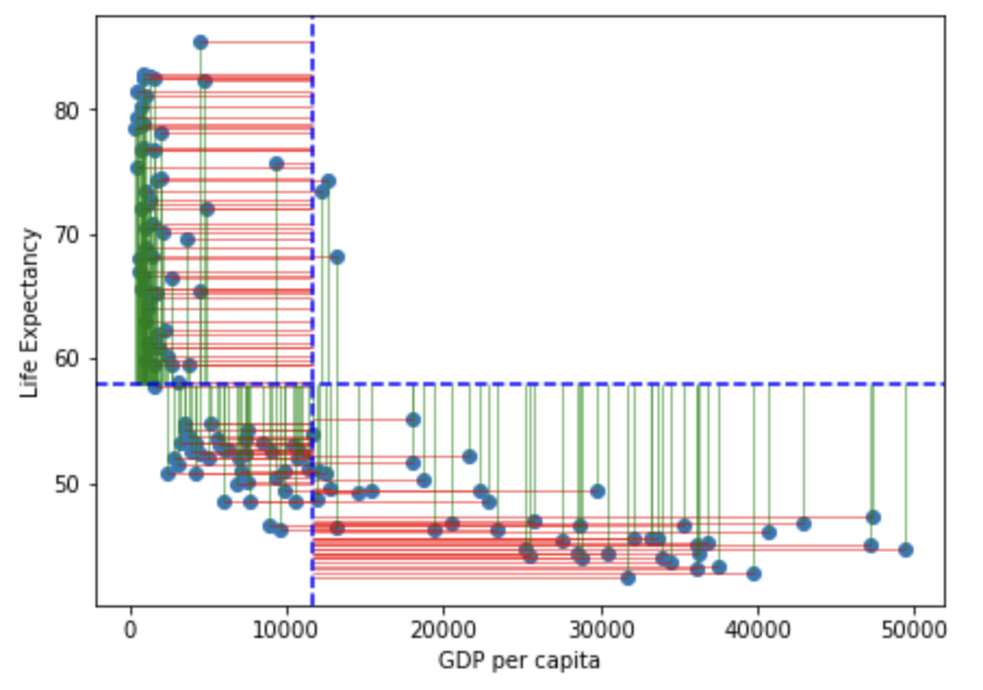
The \(Pearson's\) \(r\) is now the reverse of the data before this transformation, i.e. r=-.679. Notice how there’s consistency in the above average \(x\) values being associated with below average \(y\) values, and vice-versa.
You may have noticed that the data above looks like it’s not normally distributed, so lets check skewness and kurtosis to see if we should use Spearman’s Rho (AKA Spearman’s Rank) instead:
# Skewness and kurtosis and their standard errors as implement by SPSS
#
# Reference: pp 451-452 of
# http://support.spss.com/ProductsExt/SPSS/Documentation/Manuals/16.0/SPSS 16.0 Algorithms.pdf
#
# See also: Suggestion for Using Powerful and Informative Tests of Normality,
# Ralph B. D'Agostino, Albert Belanger, Ralph B. D'Agostino, Jr.,
# The American Statistician, Vol. 44, No. 4 (Nov., 1990), pp. 316-321

spssSkewKurtosis=function(x) {
  w=length(x)
  m1=mean(x)
  m2=sum((x-m1)^2)
  m3=sum((x-m1)^3)
  m4=sum((x-m1)^4)
  s1=sd(x)
  skew=w*m3/(w-1)/(w-2)/s1^3
  sdskew=sqrt( 6*w*(w-1) / ((w-2)*(w+1)*(w+3)) )
  kurtosis=(w*(w+1)*m4 - 3*m2^2*(w-1)) / ((w-1)*(w-2)*(w-3)*s1^4)
  sdkurtosis=sqrt( 4*(w^2-1) * sdskew^2 / ((w-3)*(w+5)) )

  ## z-scores added by reading-psych
  zskew = skew/sdskew
  zkurtosis = kurtosis/sdkurtosis

  mat=matrix(c(skew,kurtosis, sdskew,sdkurtosis, zskew, zkurtosis), 2,
        dimnames=list(c("skew","kurtosis"), c("estimate","se","zScore")))
  return(mat)
}
spssSkewKurtosis(gapminder_2007$gdpPercap)
estimate se zScore
skew 1.2241977 0.2034292 6.0178067
kurtosis 0.3500942 0.4041614 0.8662238spssSkewKurtosis(gapminder_2007$lifeExp) estimate se zScore
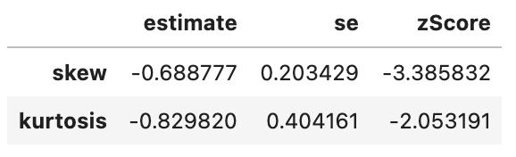
skew -0.6887771 0.2034292 -3.385832
kurtosis -0.8298204 0.4041614 -2.053191# Skewness and kurtosis and their standard errors as implement by SPSS
#
# Reference: pp 451-452 of
# http://support.spss.com/ProductsExt/SPSS/Documentation/Manuals/16.0/SPSS 16.0 Algorithms.pdf
#
# See also: Suggestion for Using Powerful and Informative Tests of Normality,
# Ralph B. D'Agostino, Albert Belanger, Ralph B. D'Agostino, Jr.,
# The American Statistician, Vol. 44, No. 4 (Nov., 1990), pp. 316-321
def spssSkewKurtosis(x):
import pandas as pd
import math
w=len(x)
m1=x.mean()
m2=sum((x-m1)**2)
m3=sum((x-m1)**3)
m4=sum((x-m1)**4)
s1=(x).std()
skew=w*m3/(w-1)/(w-2)/s1**3
sdskew=math.sqrt( 6*w*(w-1) / ((w-2)*(w+1)*(w+3)) )
kurtosis=(w*(w+1)*m4 - 3*m2**2*(w-1)) / ((w-1)*(w-2)*(w-3)*s1**4)
sdkurtosis=math.sqrt( 4*(w**2-1) * sdskew**2 / ((w-3)*(w+5)) )
## z-scores added by reading-psych
zskew = skew/sdskew
zkurtosis = kurtosis/sdkurtosis
mat = pd.DataFrame([[skew, sdskew, zskew],[kurtosis, sdkurtosis, zkurtosis]], columns=['estimate','se','zScore'], index=['skew','kurtosis'])
return mat
spssSkewKurtosis(gapminder_2007["gdpPercap"])
spssSkewKurtosis(gapminder_2007["lifeExp"])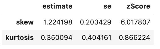
As GDP and Life Expectancy skewness and (kurtosis for life expectancy) estimates are more than 1.96 * their standard errors (i.e. their z-scores are above 1.96), we have significant evidence that the data for both variabels is not normally distributed, and thus we can/should complete a Spearman’s Rank/Rho correlation (in the next subsection).
Spearman’s Rank (AKA Spearman’s Rho)
Spearman’s Rank correlation is identical to a Pearson correlation (described above), but adds a step of converting all the data into ranks before conducting any analyses. This is useful because ranks are not vulnerable to outlier (i.e. unusually extreme) data points. Let’s now turn the gapminder data we’ve been working with above into ranks and then run a Pearson’s correlation on it to confirm this:
gapminder_2007$gdpPercap_rank <- rank(gapminder_2007$gdpPercap)
gapminder_2007$lifeExp_rank <- rank(gapminder_2007$lifeExp)gapminder_2007["gdpPercap_rank"] = gapminder_2007["gdpPercap"].rank()
gapminder_2007["lifeExp_rank"] = gapminder_2007["lifeExp"].rank()Lets do a quick check to see that ranking the data addresses the problems with skewness and kurtosis:
spssSkewKurtosis(gapminder_2007$gdpPercap_rank) estimate se zScore
skew 0.0 0.2034292 0.000000
kurtosis -1.2 0.4041614 -2.969111spssSkewKurtosis(gapminder_2007$lifeExp_rank) estimate se zScore
skew 0.0 0.2034292 0.000000
kurtosis -1.2 0.4041614 -2.969111spssSkewKurtosis(gapminder_2007["gdpPercap_rank"])
spssSkewKurtosis(gapminder_2007["lifeExp_rank"])
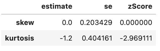
This has successfully removed any issue with skewness of the data, but has made the data more platykurtic (i.e. flatter). A problem with platykurtic data is that parametric tests might be over sensitive to identifying significant effects (see kurtosis), i.e. be at a higher risk of false positives. This is evidence that using a Spearman’s Rank may increase a risk of a false-positive (at least with this data), so another transformation of the data may be more appropriate to avoid this problem with kurtosis.
For now, lets focus on how much of the variance in ranks is explained in the overlap in variance of \(gdp\) and \(life\) \(expectancy\) ranks:
# Pearson correlation on **ranked** data:
cor.test(gapminder_2007$gdpPercap_rank, gapminder_2007$lifeExp_rank, method = "pearson")
    Pearson's product-moment correlation

data:  gapminder_2007$gdpPercap_rank and gapminder_2007$lifeExp_rank
t = 19.642, df = 140, p-value < 2.2e-16
alternative hypothesis: true correlation is not equal to 0
95 percent confidence interval:
 0.8055253 0.8950257
sample estimates:
      cor
0.8565899
# Spearman correlation applied to original data (letting R do the ranking)
cor.test(gapminder_2007$gdpPercap, gapminder_2007$lifeExp, method = "spearman")
    Spearman's rank correlation rho

data:  gapminder_2007$gdpPercap and gapminder_2007$lifeExp
S = 68434, p-value < 2.2e-16
alternative hypothesis: true rho is not equal to 0
sample estimates:
      rho
0.8565899
# Pearson correlation on **ranked** data:
scipy.stats.pearsonr(gapminder_2007["gdpPercap_rank"], gapminder_2007["lifeExp_rank"])
# Spearman correlation applied to original data (letting R do the ranking)
scipy.stats.spearmanr(gapminder_2007["gdpPercap"], gapminder_2007["lifeExp"])(0.8565899189213543, 4.6229745362984015e-42)
SpearmanrResult(correlation=0.8565899189213544, pvalue=4.62297453629821e-42)The \(r\) value is now .857, suggesting that the overlap between \(gdp\) and \(life\) \(expectancy\) explains 85.7% of the total variance of the ranks for both of them.
Lets visualise this using similar principles above on the ranks of \(gdp\) and \(life\) \(expectancy\):
rank_resid <- ggplot(
  data = gapminder_2007,
  aes(
    x=gdpPercap_rank,
    y=lifeExp_rank
  )
) +
  geom_point() +
  geom_vline(
    xintercept = mean(gapminder_2007$gdpPercap_rank),
    linetype   = "dashed",
    color      = "#006599",
    size       = 1
  ) +
  #coord_cartesian(ylim = c(30, 85)) +
  xlab("GDP per capita (RANK)") +
  ylab("Life Expectancy (RANK)") +
  geom_segment(
    aes(
      xend = mean(gdpPercap_rank),
      yend = lifeExp_rank,
      color = "GDP residuals"
    )
  ) +
  geom_segment(
    aes(
      xend = gdpPercap_rank,
      yend = mean(lifeExp_rank),
      color = "Life Expectancy Residuals"
    )
  ) +
  geom_hline(
    yintercept = mean(gapminder_2007$lifeExp_rank),
    linetype   = "dashed",
    color      = "#006599",
    size       = 1
  )

rank_resid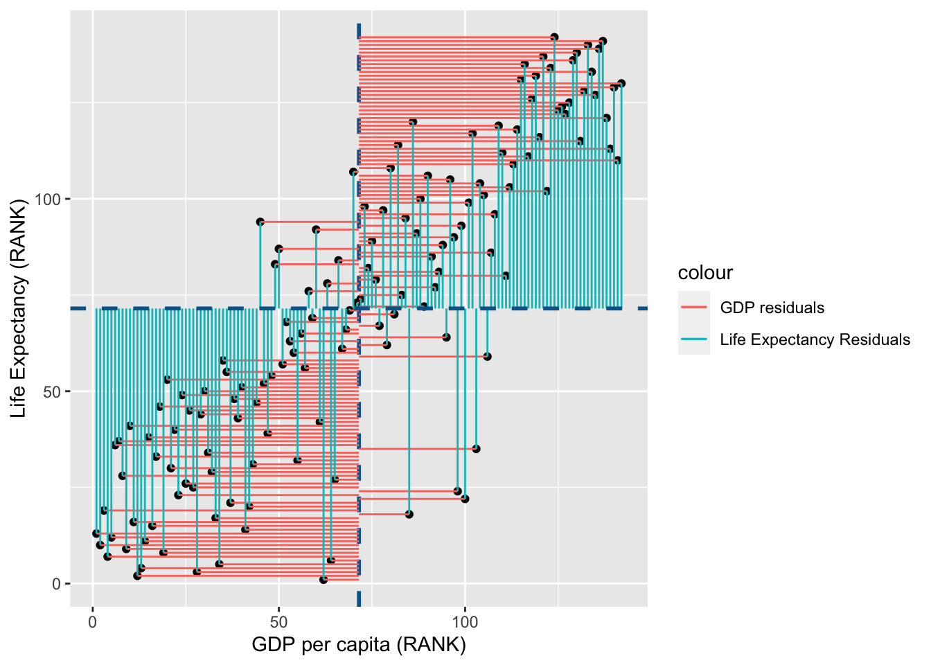
import matplotlib.patches as mpatches
import matplotlib.pyplot as plt

fig, ax = plt.subplots(figsize =(7, 5))

#scatter plot for the dataset
plt.scatter(gapminder_2007["gdpPercap_rank"], gapminder_2007["lifeExp_rank"])

# add vertical line for the mean of "gdpPercap"
plt.axvline(x=gapminder_2007["gdpPercap_rank"].mean(), color='b', ls='--')

# add horizontal lines from the individual point to the mean of "gdpPercap"
plt.hlines(y=gapminder_2007["lifeExp_rank"],xmin=gapminder_2007["gdpPercap_rank"], xmax=gapminder_2007["gdpPercap_rank"].mean(), colors='red', lw=0.5)

# add horizontal line for the mean of "lifeExp"
plt.axhline(y=gapminder_2007["lifeExp_rank"].mean(), color='b', ls='--')

# add vertical lines from the individual point to the mean of "lifeExp"
plt.vlines(x=gapminder_2007["gdpPercap_rank"],ymin=gapminder_2007["lifeExp_rank"], ymax=gapminder_2007["lifeExp_rank"].mean(), colors='green', lw=0.5)

# add title on the x-axis
plt.xlabel("GDP per capita (RANK)")

# add title on the y-axis
plt.ylabel("Life Expectancy (RANK)")

red_patch = mpatches.Patch(color='red', label='GDP Residuals')
green_patch = mpatches.Patch(color='green', label='Life Expectancy Residuals')

plt.legend(handles=[red_patch, green_patch],bbox_to_anchor=(1.05, 1), loc=2, borderaxespad=0.)

# show the plot
plt.show()
You may notice that the variance from the mean in X and Y is more aligned in this figure than it was in the data before it was transformed into ranks (and is less skewed!):
shared_resid
As both Pearson’s R and Spearman’s Rank are calculations of the proportion of total variance that can be explained by covariance between variabels, they will always be a value between -1 (all variance is explained for a negative association) to 1 (all variance is explained for a positive association). R values are thus standardised, unlike variance and covariance values which have no limit in their values.
Consolidation questions
Question 1
Which test would be less influenced by skewed data?
Question 2
Can r values be greater than 1?