Normal Distribution
Red means that the page does not exist yet
Gray means that the page doesn’t yet have separation of different levels of understanding
Orange means that the page is started
In this website you can choose to expand or shrink the page to match the level of understanding you want.
- If you do not expand any (green) subsections then you will only see the most superficial level of description about the statistics. If you expand the green subsections you will get details that are required to complete the tests, but perhaps not all the explanations for why the statistics work.
- If you expand the blue subsections you will also see some explanations that will give you a more complete understanding. If you are completing MSc-level statistics you would be expected to understand all the blue subsections.
- Red subsections will go deeper than what is expected at MSc level, such as testing higher level concepts.
Bell curve (AKA normal distribution)
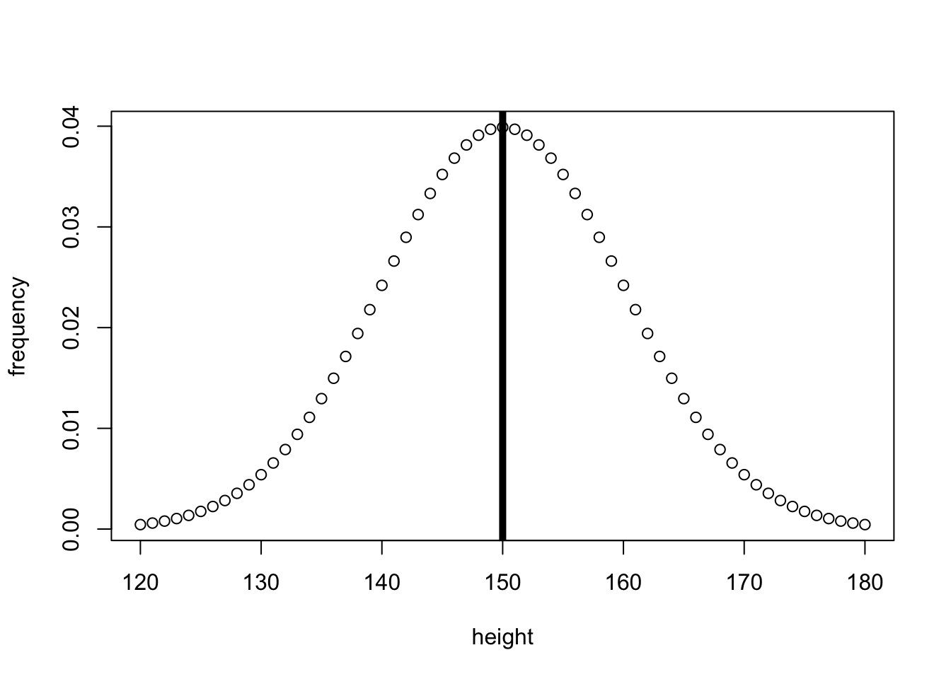
Parametric statistics often compare values to a normal distribution of expected data, based on the estimated mean and SD. Lets start by showing a (made up) normal distribution of heights in centimeters:
So lets say the average person’s height is 150cm, and the standard deviation of height across the population is 10cm. The data would look something like:
# Plot a normal distribution of heights
population_heights_x <- seq(
  120,    # min
  180,    # max
  by = 1
)
population_heights_y <- dnorm(
  population_heights_x,
  mean = 150,
  sd   = 10
)
plot(
  population_heights_x,
  population_heights_y,
  xlab = "height",
  ylab = "frequency"
)
# Add line to show mean and median
abline(
  v=150,  # where the line for the mean will be
  lwd=5
)
# Plot a normal distribution of heights
import numpy as np
from scipy.stats import norm
import matplotlib.pyplot as plt
from matplotlib.ticker import FormatStrFormatter

# vector for the x-axis
population_heights_x = [x for x in range(120, 181, 1)]

# vector for the y-axis
population_heights_y = norm.pdf(population_heights_x, loc=150, scale=10)

fig, ax = plt.subplots(figsize =(7, 5))
ax.yaxis.set_major_formatter(FormatStrFormatter('%.2f'))

# plot
plt.scatter(population_heights_x, population_heights_y, color='w', edgecolors='black')

# Add line to show mean and median
plt.axvline(x=150, color='black', ls='-', lw=5)

# add title on the x-axis
plt.xlabel("height")

# add title on the y-axis
plt.ylabel("Frequency")

# show the plot
plt.show()

# show plot
plt.show()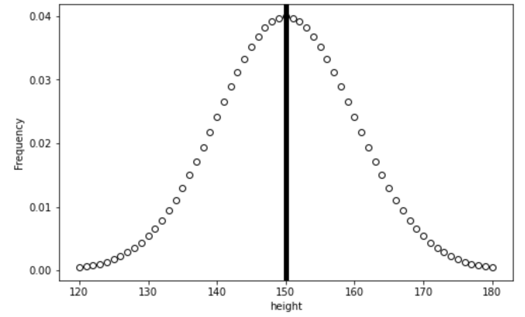
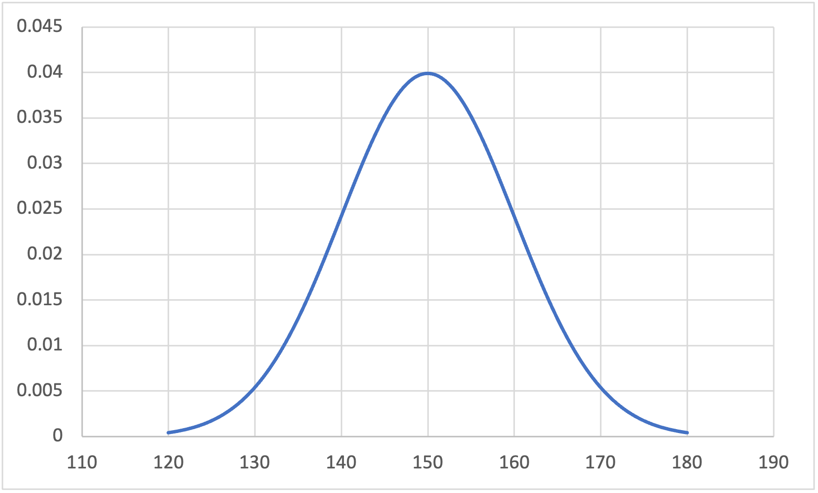
Download and open the normal.xlsx file in this repository to see data being used to create the below figure:
(note that making a vertical line to reflect the mean didn’t seem as easy in Excel as other languages, so this hasn’t been added)
Download and open height.csv in JASP, and then complete the following steps to generate the figure below:
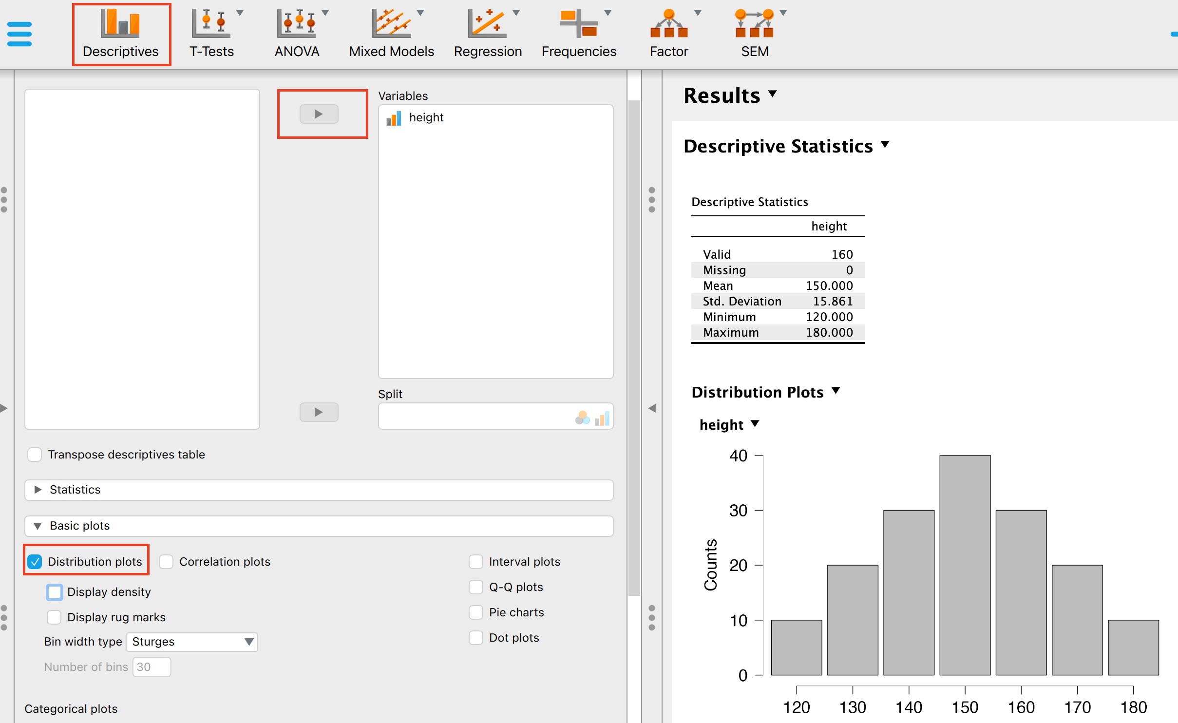
Click on the Descriptives panel
add height as a variable
open the Basic plots interface and then select Distribution plots and Display density
Download and open height.sav in SPSS and then complete the following steps to generate the figure below:
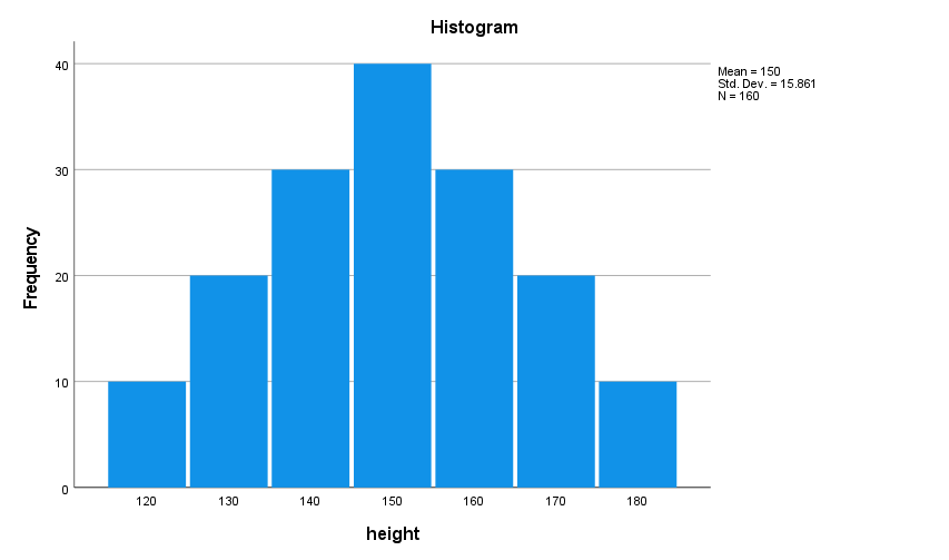
- Select Analyze –> Descriptive Statistics –> Explore…
- Move the height variable to the dependent list, then select Plots… and choose Histogram as a descriptive figure
You can see that the above fits a bell-curve, and the middle represents both the mean and the median as the data is symmetrical. In reality, almost no data is a perfect bell-curve, but there are ways to test if the data isn’t sufficiently normal to use parametric tests with.
Next, we will look at how normal distributions allow you to transform your data to z-scores to compare to a z-distribution.
Z-scores and the z-distribution
A z-score is a standardised value that captures how many standard deviations above or below the mean an individual value is. Thus, to calculate the z-score
\[ Z = \frac{individualScore-meanScore}{StandardDeviation} \]
Or in formal terminology:
\[ Z = \frac{x-\bar{x}}{\sigma} \]
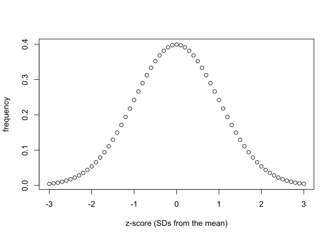
The calculated score can then be applied to a z-distribution, which is parametric/normally distributed. Lets have a look at a z-distribution:
# vector for the x-axis
z_score_x <- seq(
  -3,    # min
  3,    # max
  by = .1
)

# vector for the y-axis
z_score_y <- dnorm(
  z_score_x,
  mean = 0,
  sd   = 1
)

plot(
  z_score_x,
  z_score_y,
  xlab = "z-score (SDs from the mean)",
  ylab = "frequency"
)
import numpy as np
from scipy.stats import norm
import matplotlib.pyplot as plt
from matplotlib.ticker import FormatStrFormatter

# vector for the x-axis
z_score_x = np.arange(-3.0, 3.1, 0.1)

# vector for the y-axis
z_score_y = norm.pdf(z_score_x, loc=0, scale=1)

fig, ax = plt.subplots(figsize =(7, 5))
ax.yaxis.set_major_formatter(FormatStrFormatter('%.1f'))

# plot
plt.scatter(z_score_x, z_score_y, color='w', edgecolors='black')

# add title on the x-axis
plt.xlabel("z-score (SDs from the mean)")

# add title on the y-axis
plt.ylabel("frequency")

# show plot
plt.show()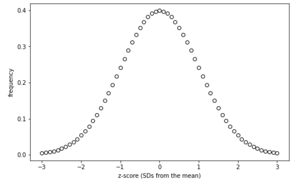
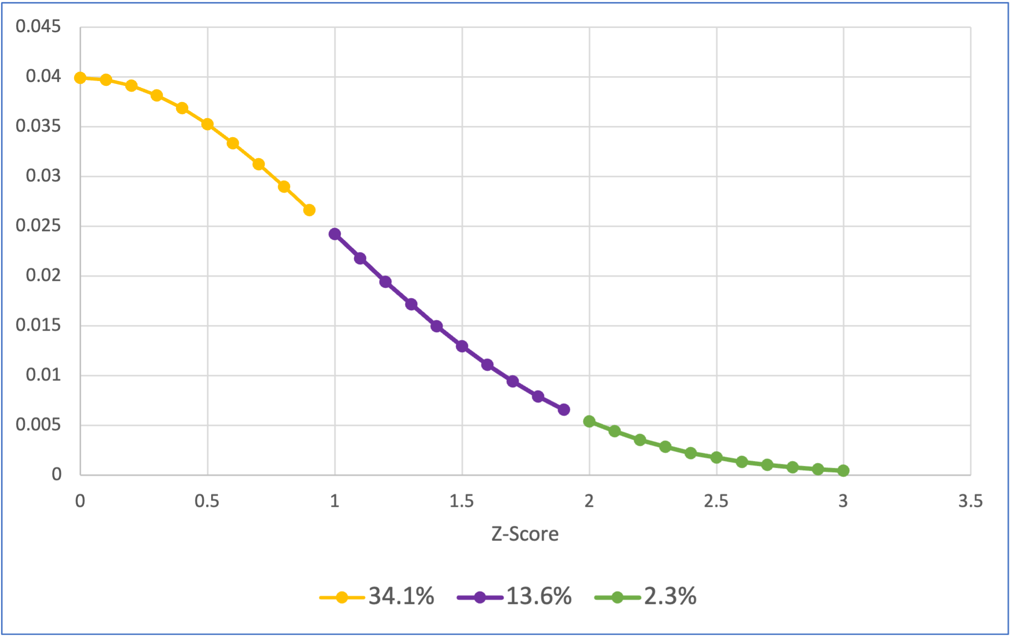
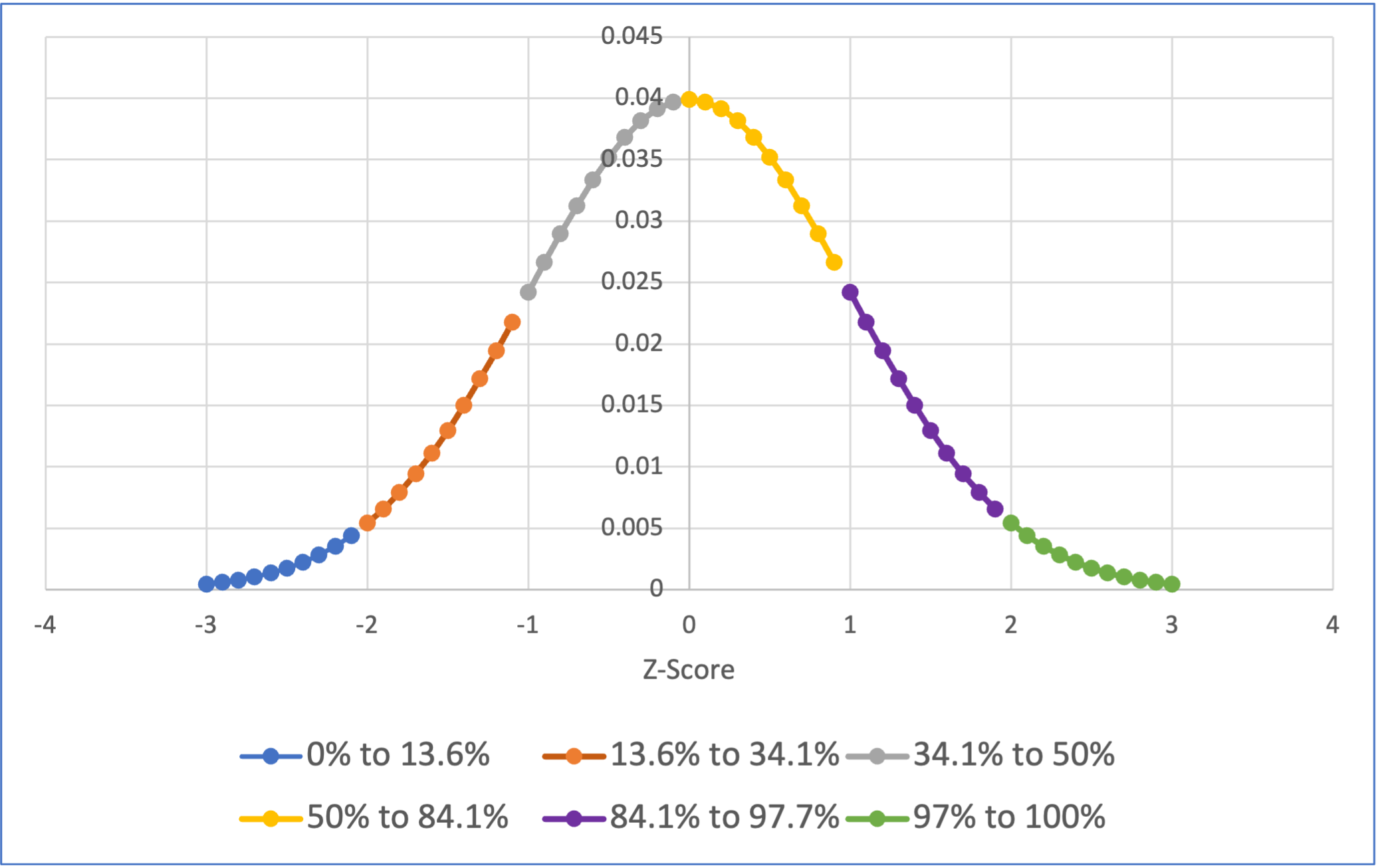
Download and open the normal_z_scores.xlsx file in this repository to see data being used to create the below figure. To get the colors you need to use the “Select Data…” option when right clicking on the chart:
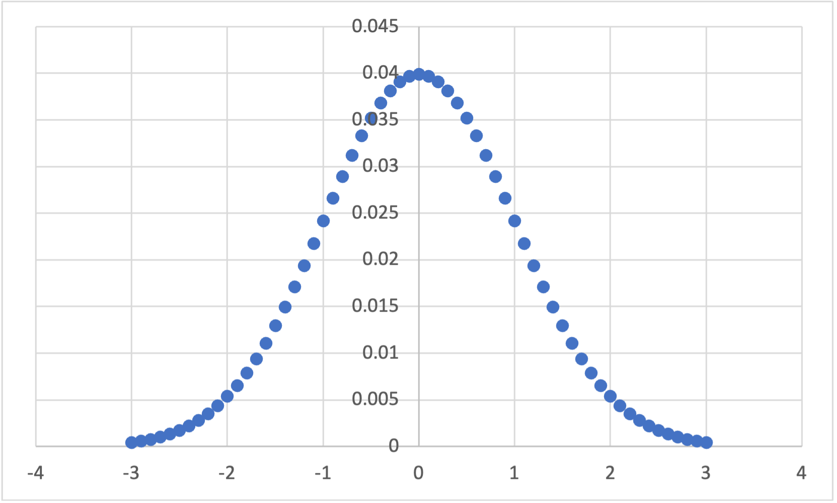
It’s not clear that generating a z-distribution like this would be helpful to do with JASP, so the Excel figure is included below:
It’s not clear that generating a z-distribution like this would be helpful to do in SPSS, so the Excel figure is included below:
If you compare the height distribution above to the z-score distribution, you should see that they are identically distributed. This is useful, as we know what percentage of a population fits within each standard deviation of a normal distribution:
library(ggplot2)
# https://stackoverflow.com/a/12429538
norm_x<-seq(-4,4,0.01)
norm_y<-dnorm(-4,4,0.0)

norm_data_frame<-data.frame(x=norm_x,y=dnorm(norm_x,0,1))


shade_50 <- rbind(
  c(0,0),
  subset(norm_data_frame, x > 0),
  c(norm_data_frame[nrow(norm_data_frame), "X"], 0))

shade_34.1 <- rbind(
  c(1,0),
  subset(norm_data_frame, x > 1),
  c(norm_data_frame[nrow(norm_data_frame), "X"], 0))


shade_13.6 <- rbind(
  c(2,0),
  subset(norm_data_frame, x > 2),
  c(norm_data_frame[nrow(norm_data_frame), "X"], 0))


p<-qplot(
  x=norm_data_frame$x,
  y=norm_data_frame$y,
  geom="line"
)
Warning: `qplot()` was deprecated in ggplot2 3.4.0. p +
geom_polygon(
data = shade_50,
aes(
x,
y,
fill="50"
)
) +
geom_polygon(
data = shade_34.1,
aes(
x,
y,
fill="34.1"
)
) +
geom_polygon(
data = shade_13.6,
aes(
x,
y,
fill="13.6"
)
) +
annotate(
"text",
x=0.5,
y=0.01,
label= "34.1%"
) +
annotate(
"text",
x=1.5,
y=0.01,
label= "13.6%"
) +
annotate(
"text",
x=2.3,
y=0.01,
label= "2.3%"
) +
xlab("Z-score") +
ylab("Frequency") +
theme(legend.position="none")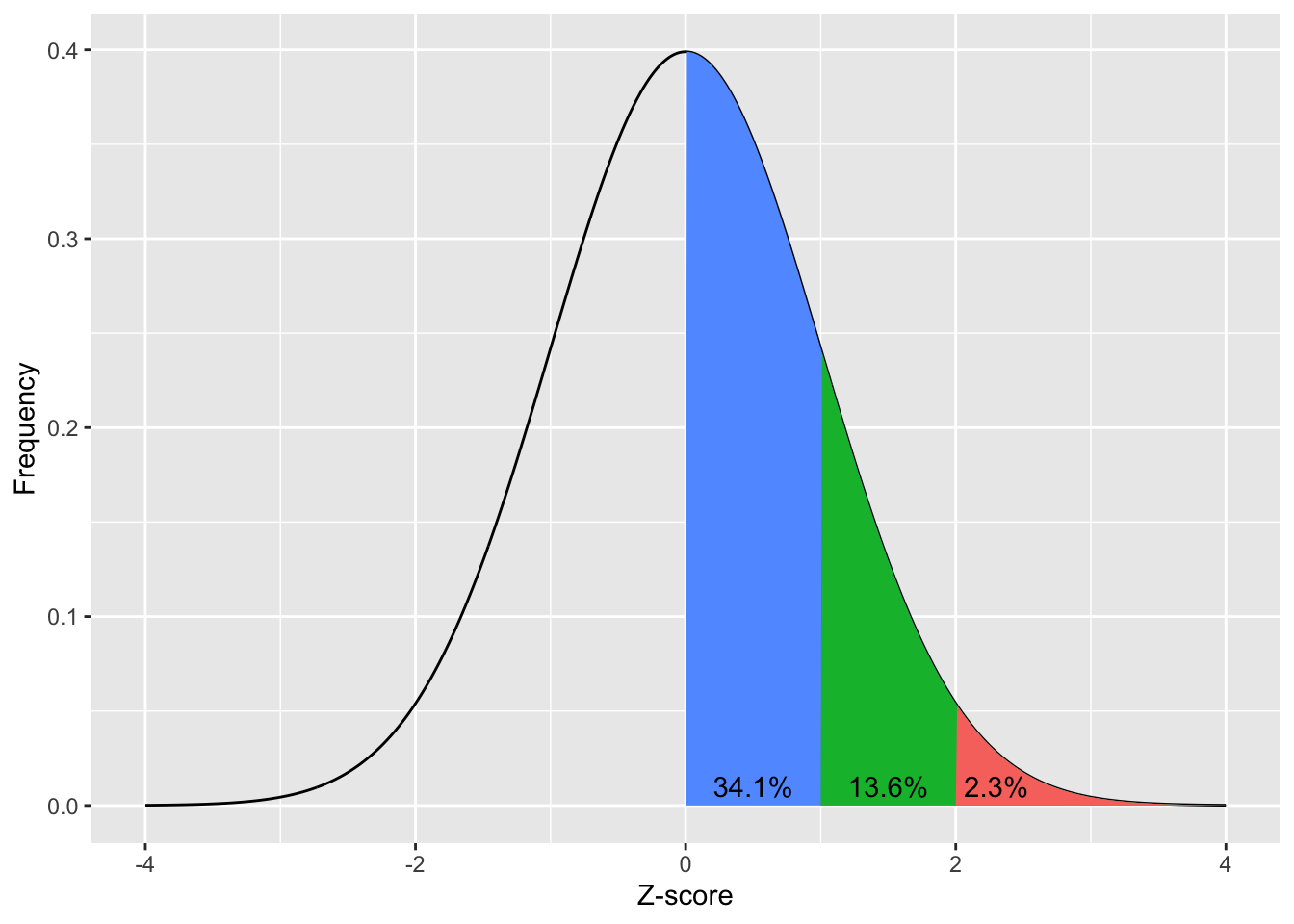
norm_x = np.arange(-4.0, 4.1, 0.1)

norm_y = norm.pdf(norm_x, loc=0, scale=1)

fig, ax = plt.subplots(figsize =(8, 5))
ax.yaxis.set_major_formatter(FormatStrFormatter('%.1f'))

ax.plot(norm_x, norm_y, color='black', alpha=1.00)
ax.fill_between(norm_x, norm_y, where= (0 <= norm_x)&(norm_x <= 1), color='blue', alpha=.4)
ax.fill_between(norm_x, norm_y, where= (1 < norm_x)&(norm_x <= 2), color='green', alpha=.4)
ax.fill_between(norm_x, norm_y, where= (norm_x > 2), color='red', alpha=.4)

plt.text(2.05, 0.001, '2.3%', fontsize = 10, color='black',weight='bold')
plt.text(1.1, 0.001, '13.6%', fontsize = 10, color='black',weight='bold')
plt.text(0.1, 0.001, '34.1%', fontsize = 10, color='black',weight='bold')

# add title on the x-axis
plt.xlabel("Z-score")

# add title on the y-axis
plt.ylabel("Frequency")

plt.show()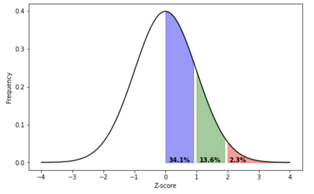
Download and open the normal_z_scores_0_plus.xlsx file in this repository to see data being used to create the below figure. To get the colors you need to use the “Select Data…” option when right clicking on the chart:
It’s not clear that generating a distribution like this would be helpful to do with JASP, so the Excel figure is included below:
It’s not clear that generating a distribution like this would be helpful to do in SPSS, so the Excel figure is included below:
The above visualises how 34.1% of a population’s scores will be between 0 and 1 standard deviation from the mean, 13.6% of the population’s scores will be between 1 to 2 standard deviations above the mean, and 2.3% of the population will be more then 2 standard deviations above the mean. Remember that the normal distribution is symmetrical, so we also know that 34.1% of the population’s score will be between 0 to 1 standard deviations below the mean (or 0 to -1 SDs), 13.6% of the population’s score will be between -2 to -1 standard deviations from the mean, and 2.3% of the population’s score will be more negative than -2 standard deviations from the mean. Lets look at this cumulative distribution:
# https://stackoverflow.com/a/12429538
norm_x<-seq(-4,4,0.01)
norm_y<-dnorm(-4,4,0.0)

norm_data_frame<-data.frame(x=norm_x,y=dnorm(norm_x,0,1))


shade_2.3 <- rbind(
  c(-8,0),
  subset(norm_data_frame, x > -8),
  c(norm_data_frame[nrow(norm_data_frame), "X"], 0))

shade_13.6 <- rbind(
  c(-2,0),
  subset(norm_data_frame, x > -2),
  c(norm_data_frame[nrow(norm_data_frame), "X"], 0))

shade_34.1 <- rbind(
  c(-1,0),
  subset(norm_data_frame, x > -1),
  c(norm_data_frame[nrow(norm_data_frame), "X"], 0))

shade_50 <- rbind(
  c(0,0),
  subset(norm_data_frame, x > 0),
  c(norm_data_frame[nrow(norm_data_frame), "X"], 0))

shade_84.1 <- rbind(
  c(1,0),
  subset(norm_data_frame, x > 1),
  c(norm_data_frame[nrow(norm_data_frame), "X"], 0))


shade_97.7 <- rbind(
  c(2,0),
  subset(norm_data_frame, x > 2),
  c(norm_data_frame[nrow(norm_data_frame), "X"], 0))


p<-qplot(
  x=norm_data_frame$x,
  y=norm_data_frame$y,
  geom="line"
)

 p +
   geom_polygon(
     data = shade_2.3,
     aes(
       x,
       y,
       fill="2.3"
      )
    ) +
   geom_polygon(
     data = shade_13.6,
     aes(
       x,
       y,
       fill="13.6"
      )
    ) +
   geom_polygon(
     data = shade_34.1,
     aes(
       x,
       y,
       fill="34.1"
      )
    ) +
   geom_polygon(
     data = shade_50,
     aes(
       x,
       y,
       fill="50"
      )
    ) +
   geom_polygon(
     data = shade_84.1,
     aes(
       x,
       y,
       fill="84.1"
      )
    ) +
   geom_polygon(
     data = shade_97.7,
     aes(
       x,
       y,
       fill="97.7"
      )
    ) +
   xlim(c(-4,4)) +

   annotate("text", x=-2.3, y=0.01, label= "2.3%") +
   annotate("text", x=-1.4, y=0.01, label= "15.9%") +
   annotate("text", x=-0.4, y=0.01, label= "50%") +
   annotate("text", x=0.5, y=0.01, label= "84.1%") +
   annotate("text", x=1.5, y=0.01, label= "97.7%") +
   annotate("text", x=2.3, y=0.01, label= "100%") +

   xlab("Z-score") +
   ylab("Frequency") +
   theme(legend.position="none")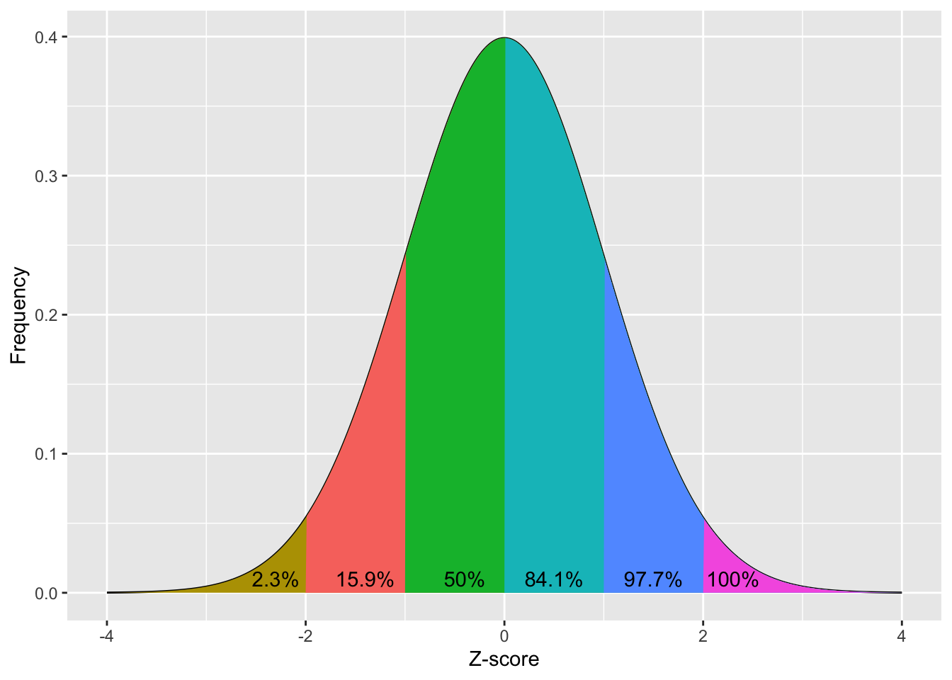
norm_x = np.arange(-4.0, 4.1, 0.1)

norm_y = norm.pdf(norm_x, loc=0, scale=1)

fig, ax = plt.subplots(figsize =(8, 5))
ax.yaxis.set_major_formatter(FormatStrFormatter('%.1f'))

ax.plot(norm_x, norm_y, color='black', alpha=1.00)
ax.fill_between(norm_x, norm_y, where= (norm_x < -2), color='gold', alpha=.4)
ax.fill_between(norm_x, norm_y, where= (-2 <= norm_x)&(norm_x <= -1), color='red', alpha=.4)
ax.fill_between(norm_x, norm_y, where= (-1 <= norm_x)&(norm_x <= 0), color='green', alpha=.4)
ax.fill_between(norm_x, norm_y, where= (0 <= norm_x)&(norm_x <= 1), color='cyan', alpha=.4)
ax.fill_between(norm_x, norm_y, where= (1 < norm_x)&(norm_x <= 2), color='blue', alpha=.4)
ax.fill_between(norm_x, norm_y, where= (norm_x > 2), color='purple', alpha=.4)

plt.text(2.05, 0.001, '100%', fontsize = 10,color='black',weight='bold')
plt.text(1.2, 0.001, '97.7%', fontsize = 10,color='black',weight='bold')
plt.text(0.2, 0.001, '84.1%', fontsize = 10,color='black',weight='bold')
plt.text(-0.8, 0.001, '50%', fontsize = 10,color='black',weight='bold')
plt.text(-1.85, 0.001, '15.9%', fontsize = 10,color='black',weight='bold')
plt.text(-2.7, 0.001, '2.3%', fontsize = 10,color='black',weight='bold')

plt.yticks(np.arange(0, 0.5, step=0.1))

# add title on the x-axis
plt.xlabel("Z-score")

# add title on the y-axis
plt.ylabel("Frequency")


plt.show()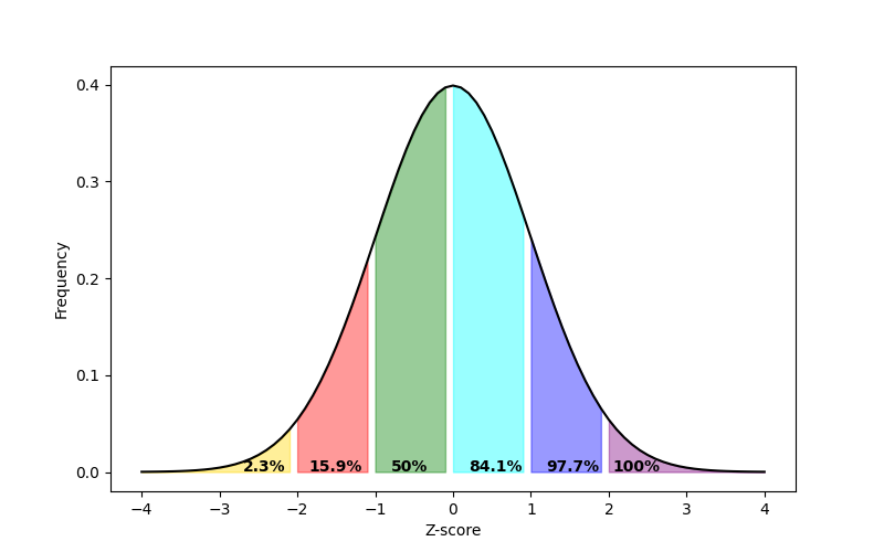
Download and open the normal_z_scores_percentages.xlsx file in this repository to see data being used to create the below figure. To get the colors you need to use the “Select Data…” option when right clicking on the chart:
It’s not clear that generating a distribution like this would be helpful to do with JASP, so the Excel figure is included below:
It’s not clear that generating a distribution like this would be helpful to do in SPSS, so the Excel figure is included below:
The above figure visualises how 13.6% of the population have score that is more negative than -2 standard deviations from the mean, 34.1% of the population have a standard deviation that is more negative than -1 standard deviations from the mean (this also include all the people who are more than -2 standard deviations from the mean), etc.
We can now use the above information to identify which percentile an individual is within a distribution.
For example, let’s imagine that an individual called Jane wants to know what percentile she’s at with her height. Lets imagine she is 170cm tall, the mean height of people 150cm, and the SD 10cm. That would make her z-score:
\[ Z_{score} = \frac{170 - 150}{10} = 2 \]
As we can see from the figure above, that puts her above 97.7% of the population, putting her in the top 2.3%.
Consolidation questions
Question 1
Jamie has just completed a mathematics test, where the maximum score is 100%. Their score was , the mean maths score was and the SD was . What is their Z-score?
Your answer is… .
Question 2
Using the above value, which percentile group would you put Jamie’s score into?
Your answer is… .
If you want to practice with different numbers in these questions then please reload the page.